Internet Archive

Helps users discover relevant articles, books, and research papers on Internet Archive’s vast collection of 41M+ items

My Role:

My role in this project spanned from research & strategy, content development, and visual design.

Impact:

Assisting 1M+ user to discover Internet Archive's Wealth into intuitive experience. Improved platform's usability.

Tools used:

Figma, SME Rush, Google Analytics, FigJam, Adobe Creative suit.

What is
Internet Archive?

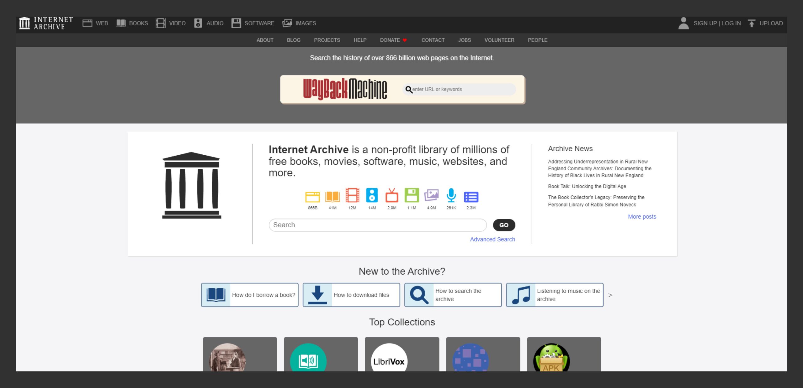
The Internet Archive is an American digital library with the mission of “universal access to all knowledge.”

It provides free access to a vast collection of digital materials , including books, movies, music, and more.

Serving millions of people daily and is one of the top 300 websites in the world.
The Context

With such a huge collection of assets, Internet Archive faced significant challenges in enabling users to effectively discover and access relevant materials from its vast digital library.
This meant that it needed a solution with careful consideration of the sheer scale and diversity of content and the users. So the goal was to help users discover Internet Archive’s Wealth into intuitive experience.

The process

why people use internet archive?

Identifying the key use cases

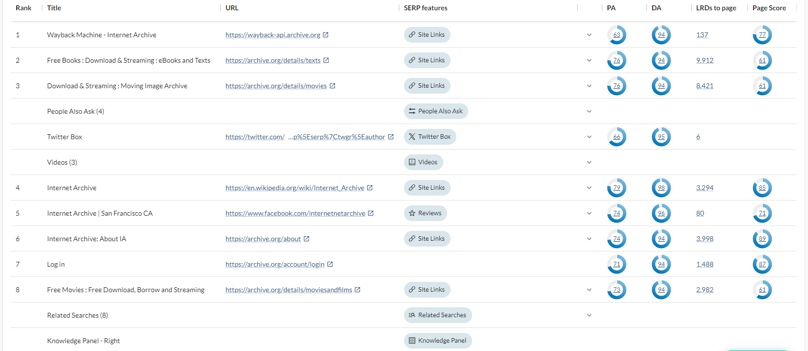
To identify the top use cases, we used MOZseo to analyze keyword ranking, search volume, and to get insights on the site traffic.

We identified the top 5 use cases to be  Search Books — Search Video Content — Music — Software — Games

what is important?

Prioritizing the flow

To identify High-Volume Searches, we used SEMrush. It provided valuable insights on search metrics such as search volume, keyword rankings, and competitor analysis.

This aided us in  prioritizing the book search flow.

how do they search now?

User journey mapping

who are these users?

Defining our users

based on the survey and talking to users, we identified three main archetypes for our use case.

Competitive analysis

Analyzing search Patterns on Digital Libraries

3-365-results-for-Yellow-·-OverDrive-ebooks-audiobooks-and-more-for-libraries-and-schools-min

Faceted search vs non-faceted search

Faceted search (using filters/facets to narrow results) is more prevalent than non-faceted search in terms of number of unique queries, time spent, clicks, and downloads.

Impact of search interface design

The design of the search interface, including the presentation of facets/filters and result lists, . can significantly influence user search patterns and behavior.

Opportunity Areas

I converted the identified pain points into "how might we" statements. We assumed this approach would help us prioritize and address these issues effectively during the solution development process.

Overwhelming filter system​

Lacked information hierarchy ​​

Cluttered Search experience​​

Unreliable Search results

1
1
1
1
How might we simplify the filtering options to provide a more streamlined and intuitive experience for users searching through large content catalogs?
How might we establish a clear and logical information hierarchy that allows users to easily navigate and comprehend the available content and metadata?
How might we declutter the search interface and present information in a clean and organized manner, reducing cognitive load for users?
How might we enhance the search relevancy ranking to deliver more accurate and trustworthy results that meet users' expectations?

Wireframes

Testing

Did a round of click test with the intended users to test if the new layout matched the existing mental models. 
Final solution and Iterations:

Opportunity 1

How might we declutter the search interface and present information in a clean and organized manner, reducing cognitive load for users?

Improved search functionality

2
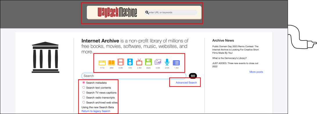
Old version: Poor search experience
The webpage exhibits a high density of options, potentially impeding users from swiftly identifying crucial elements during their rapid visual assessment increasing Cognitive overload.

We implemented a “Scope search” functionality, comprising distinct categories such as “Book,” “Music,” and others, strategically employed to constrain users’ selection choices.
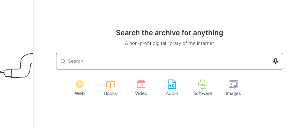
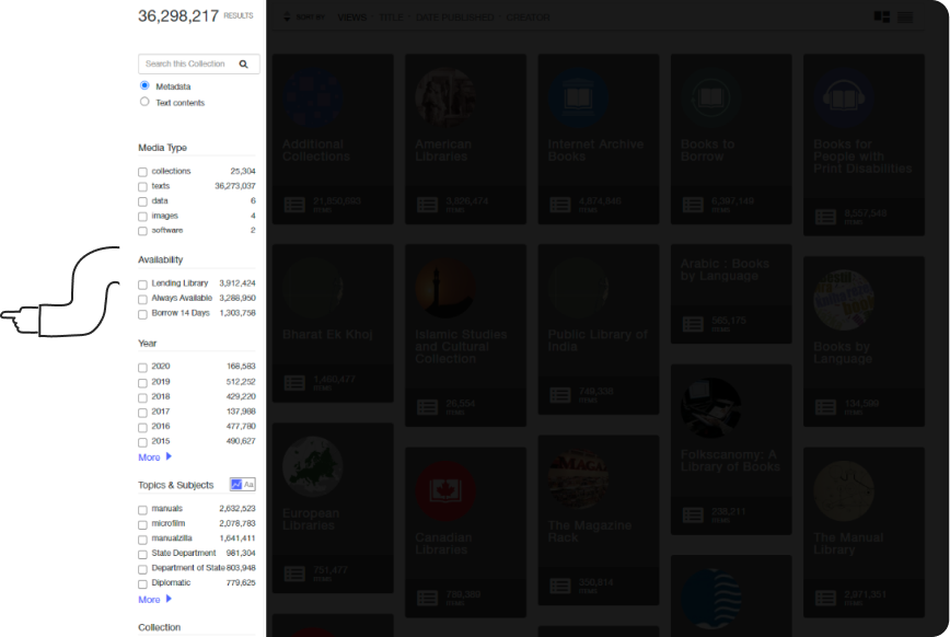
Through reduction of visual clutter, we have prioritized the primary page function, ensuring heightened user attention. This is achieved via a streamlined and precisely defined categorization approach, enhancing user comprehension and interaction.

New version: Clear and concise CTA

Opportunity 1

How might we declutter the search interface and present information in a clean and organized manner, reducing cognitive load for users?

2. Filtering System​

Placing the filters within a side modal has the effect of diminishing discoverability.

The first thing users would do on the book page is filter and then browse results. In the old version of a book page, the filters were hidden in a side modal which was a poor experience as it reduced the discoverability of filters.

New version: Displaying filters upfront
Top Navigation with Visible Filters. Utilizing a top-aligned horizontal tab interface with upfront filters enhances discoverability, enabling users to quickly specify search criteria and access desired results.

By making the filters available in the primary view, users can quickly access the filters and narrow down their results. It also helps users understand the primary filters if they are unsure where to begin.​

Opportunity 3

How might we establish a clear and logical information hierarchy that allows users to easily navigate and comprehend the available content and metadata?

3. Collection and Book Cards

The cards are the most important part of discoverability. They contain all the information that users are looking for.

Let’s go over the various card iterations and the design decisions behind each.

➼ No hierarchy of information
➼ No information grouping
➼ The bookmark looks disabled
➼ Inconsistent card size
➼Information seems a bit cramped
➼The share button did not add any value for the users
➼The download button was hidden
➼Too much white space
➼Readability issues - small fonts and icons
➼Not clear Signifier - type of book

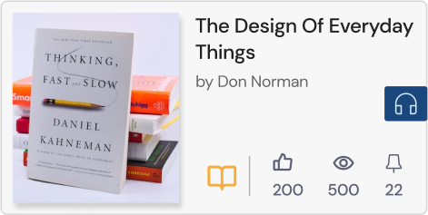
Final Card

Redesigning search results for a simplified, user-friendly experience with reduced cognitive load and enhanced usability.

➼Prominent book name
➼Scannable layout
➼Visually appealing design
➼Clear Signifier on type of book – audio or e-book

Opportunity 4

How might we enhance the search relevancy ranking to deliver more accurate and trustworthy results that meet users' expectations?

4. Displaying the results​

Redesigning search results for a simplified, user-friendly experience with reduced cognitive load and enhanced usability.

Cluttered search results page
Recognizing diverse user backgrounds, terms like ‘Metadata’ and ‘Text contents,’ are overly technical.

Through reduction of visual clutter, we have prioritized the primary page function, ensuring heightened user attention. This is achieved via a streamlined and precisely defined categorization approach, enhancing user comprehension and interaction.

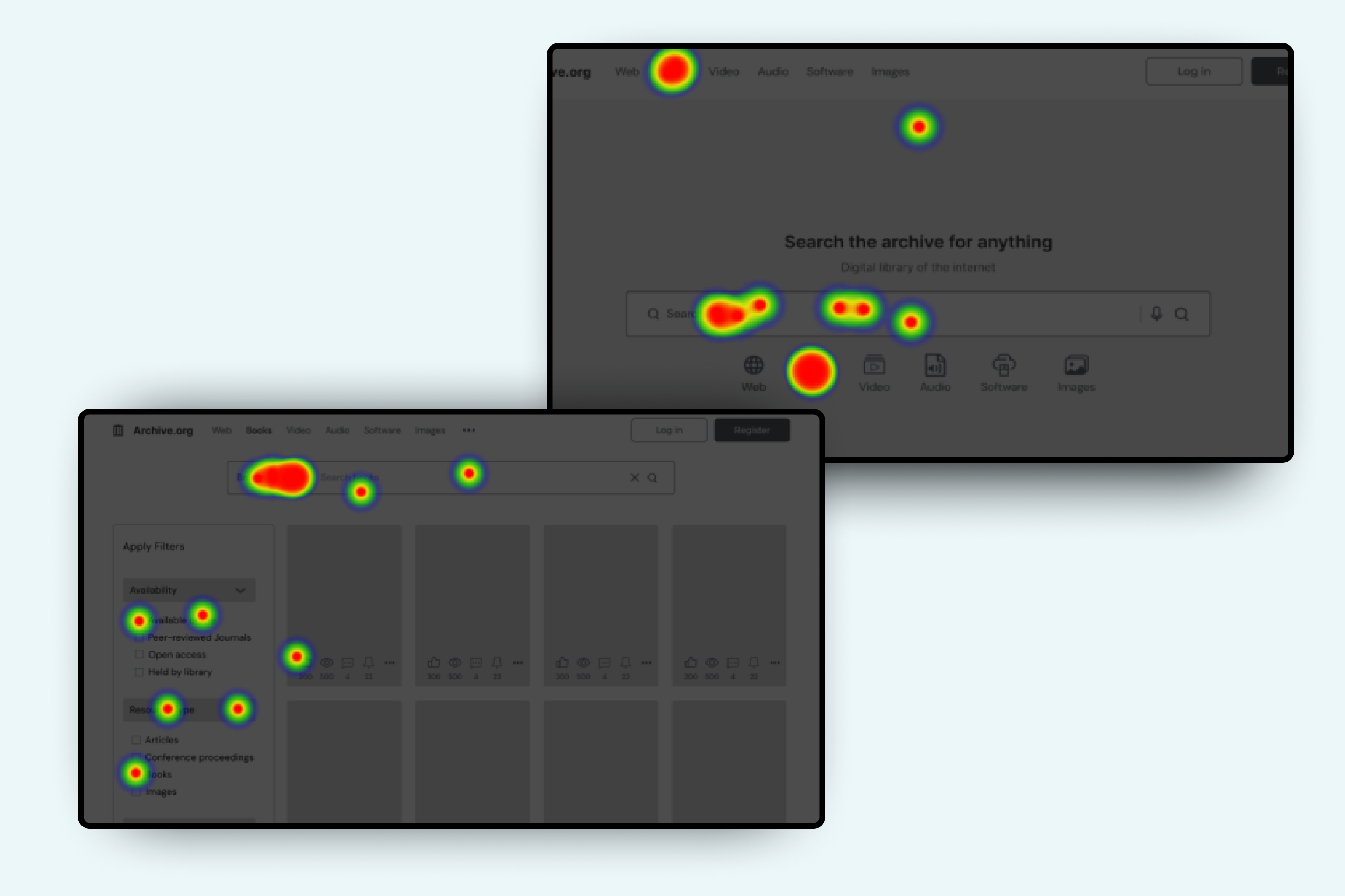
Placing the search box where users expect it, aligned with their natural, “F-pattern scanning” to enhance the usability and user experience.

New version: Clear and concise CTA

🧠Key takeaways

Think out of the box. Brainstorming sessions are most productive when group members come in with sets of unique ideas and then can combine and refine them together. Some of our best designs were developed by including aspects from multiple other ideas, which were then refined to cover divergent types of models, systems, or modes of interaction.

Countering omniscience bias: People tend to overshoot their confidence in general cognition. For example, the viewers are expected to understand more than three-fourths of all jokes in a TV show. Whereas in reality, they got about half of the jokes. Applications should be designed with the assumption that the majority of users find it hard to comprehend the functionally designers take for granted.

Remind participants that it is a prototype. We found that participants in our study would often comment on the speed and stability of the system. Although it may have been helpful to allow a given user free reign of the system in the evaluation process, too much freedom detracts from the time necessary to complete the given tasks and may lead to unrecoverable system instability.