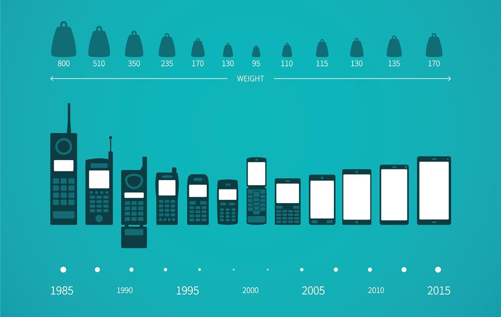
Smartphones have evolved dramatically over a decade ,from single-handed to foldable screens pushing the boundaries of user interaction.
It’s intriguing how these 6-inch devices have become integral to daily life, shaping behaviors, influencing cultures, and driving innovation. Thus demanding meticulously designed interfaces for a superior user experience.
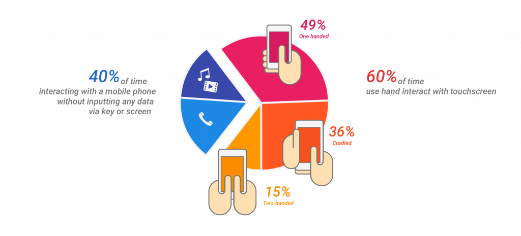
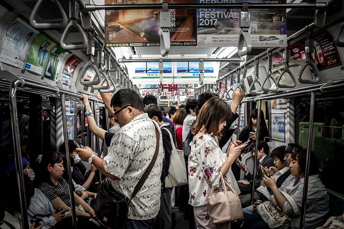
50% of users prefer using their phones in a single hand says research.
With larger screens, accessibility and reachability suffer.
Due to wider and taller screens, users are forced to operate with two hands.
There is a segment of people who are still using iPhone 5 just for this reason. They love the experience of navigating with a single hand. The goal of providing a beautiful visual experience is good. But the bigger mission is to assist users in their daily routine, to extend their capability, to enhance productivity, and to make life easier. And we cannot ignore the fact that people multitask. Many a time they are shopping while travelling in a metro holding on to the pole, watching a lecture simultaneously taking notes, chatting while sipping a cup of coffee, considering all the possibilities devices should be designed to assist the behaviors of the users.
To tackle this problem, Apple designed a brilliant float button that navigates to the most important sections the users prefer. People love it. Later they introduced a double tap on the home button. It worked like a charm, a simple yet effective solution.
Possible design solutions
Layout Design:
As a designer, always try to create interfaces with minimal reachability issues that are easy to navigate.
Navbar: Placing the navbar at the bottom left/right corner of the page.
Rationale: Most of the users use their left / right thumb on the phone navigation menu. There’s already a mental model created for this pattern. I prefer designing websites and apps on this model.
it’s ok to break the rules.
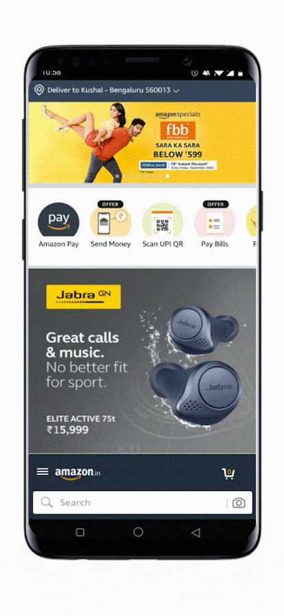
Amazon's app Interface reimagined
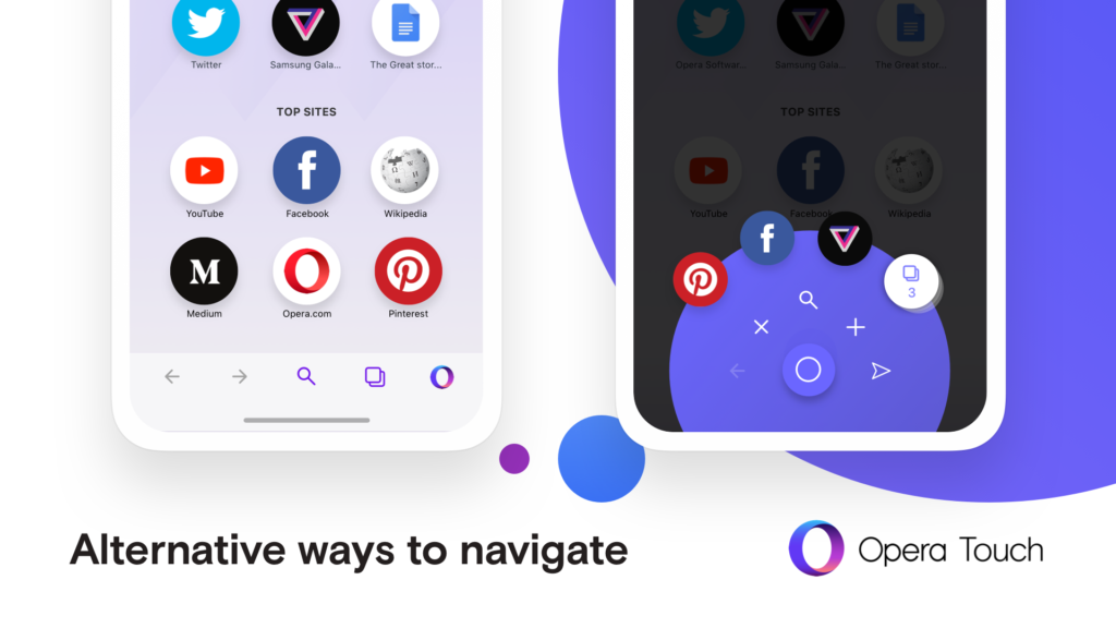
No doubt, Google is one of the most user-centric companies. This issue cannot go unnoticed under the lens of their UX team. They are experimenting with an interesting solution for the chrome android browser. The tabs opened are placed at the bottom of the screen that is now easily navigable. Navbars assisting thumbs are the future
Another OG browser company has introduced a new browser just around this problem.
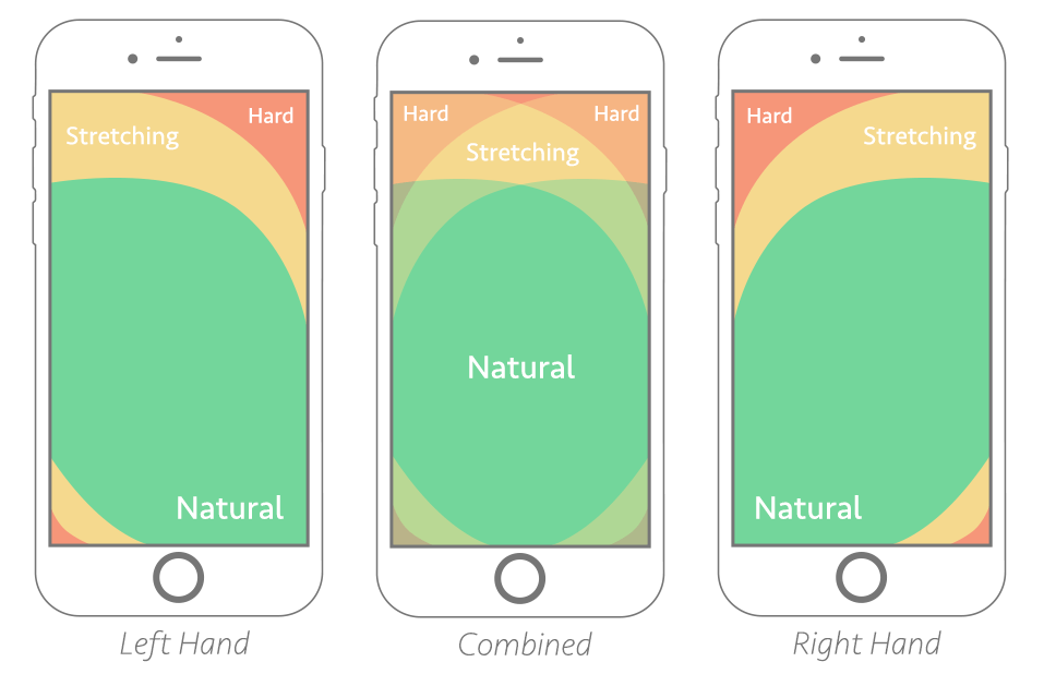
Thumb zones
Another factor to be considered while designing interfaces for single-hand navigation is thumb zone mapping. The blow image illustrates the thumb reachability on standard 6-inch screens. To explain this there’s one simple law that is widely applied in user experience (UX) and user interface (UI) design is Fitt’s law. This applies to both desktops as well as mobile.
What is Fitt's Law?
The time to acquire a target is a function of the distance to and size of the target.
Imagine you have a toy box with different shapes and sizes of toys inside. Fitts’ Law is like trying to grab the toy you want from the box. If the toy is big and close to you, it’s easy to grab. But if it’s small or far away, it’s harder. Fitts’ Law helps us understand how easy or hard it is to reach and touch things, like toys or buttons, on a phone or computer screen.
Search bars:
Placing the search bars at the bottom of the page.
Currently, every search bar is on top of the page. This was a practice when smartphones were smaller, it’s time we adapt the interface to the modern day smartphones.
Though this goes against the reading patterns of the users. The counter-argument to this would be – we don’t use search bars to read. It’s only used to type and find the desired results.
I would love to experiment with this layout to test the adaptability of the users in my upcoming projects.
Rationale
Mental models: Whatsapp – Facebook – Instagram – Default message app
Since most of the chat UI have the text box below and the keyboard slides up from the bottom of the screen. It’s easier to focus on what you type. Here we can relate the search bar to the text box. It makes total sense to have the search bar below. The transition shouldn’t be such a major challenge as the users are already accustomed to this pattern.
An iteration of Google's material design guideline.
Product design - Smaller phones:
This might sound as absurd as it is. Convince companies to build smaller models. Though possibilities are minuscule, one successful product can create a new segment in the market. The light phone is one such example. Any experiments related to this are welcome. Industry experts predict that the design cycle to be reversed at some point.
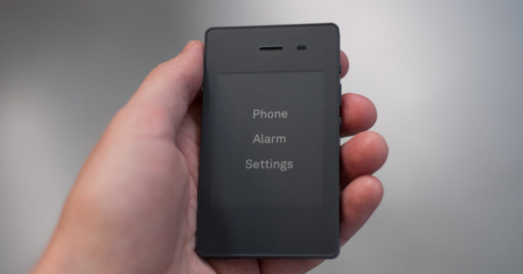
2.84-inch display. Light phone 2
While reachability is a significant consideration when designing for one-handed use, it is not the only consideration.
The dimensions of screens are changing. UX and UI design must evolve as well. To delight the users, increase engagements, and retention, design around reachability heatmaps based on research. No matter how big or small the screen is, it is our job as designers to navigate the blockages and design agile solutions to deliver smooth user experiences.
